Apple Watch Series 7 review: Big display, redesigned UI enrich experience
There is no smartwatch that complements
the iPhones the way Apple’s own watches do, even if they are not perfect.
Therefore, even if the new models do not bring any significant upgrades over
the previous-generation models, they still make a compelling buy for iPhone
users looking to upgrade to a new model. A case in point is the Apple
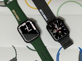
Watch Series 7. Over the Watch Series 6 (review), the Series 7 brings a
bigger display with curved edges and negligible display bezels, redesigned user
interface optimised for larger display, and new watch faces to complement the
curved display profile.
Starting with the display, the Watch
Series 7 boasts 20 per cent more screen area over the Watch Series 6.
Interestingly, the bump in screen size does not translate into any significant
changes in dimensions of the case. This is because the screen is stretched by
narrowing the borders. That said, the Apple Watch Series 7 is just 1mm (45mm,
review unit) bigger than its predecessor. The screen on the Watch Series 7 is
not just bigger, but also brighter than the last-gen models. Apple said the
screen was about 70 per cent brighter indoors than the Apple Watch Series 6.
However, the bump in brightness is available only in the Always-On display
mode. The Watch Series 7 has an impressive sunlight legibility, and with
increased brightness in always-on display mode, it has equally good indoor
legibility which makes it easier for you to read on-screen content on the watch
face without having to lift the wrist or wake the display. Read
More


Comments
Post a Comment